Feast! Then, read.
March 2019 LA Monogram Case Study
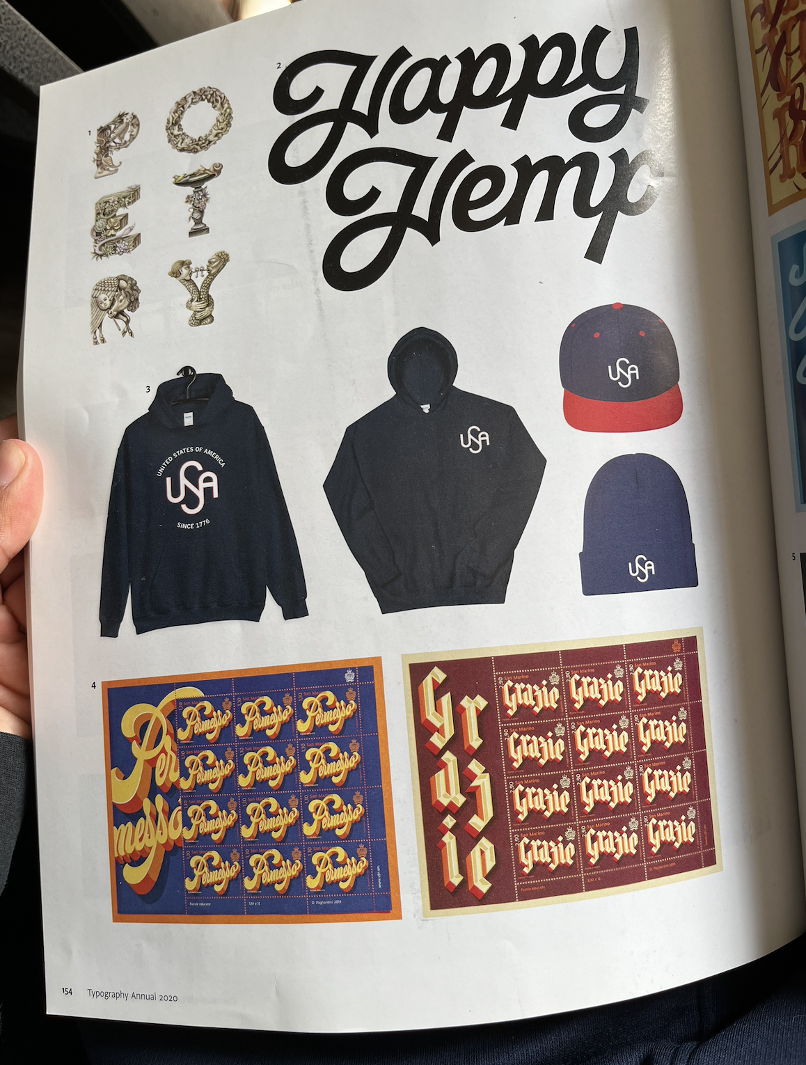
2019 USA Monogram Case Study
The Catalyst
“I saw Jon Contino’s USA monogram in a book and thought, ‘The right side of the U fits perfectly into the top of the S.’ For my Etsy shop, SeeArteaga, I took that part, then flipped it, and did the same with the left side of the A and bottom of the S. I added the spine to the S.”. See the next slides.
Initial Sketches
The Earning's Effect.
Topography like typography.
The Earning's Effect.
Topography like typography.


Final Work.
2021 Eel Power Electric Inc. Case Study
Gatorade Lightening Influence
I received this project and was drawn to the lightening gatorade sign.
Lightening Sign x Letter
I found this Lightening X Letter. This was more influence creating the Mascot Logo for Eel Powere Electric Inc.
Eellustration Influence
I was influenced from this style of Eel and multiplied it with the lightening sign and made the following mascot logo.
Reasoning
This mascot logo was made to look like a Sigma(the sum sign(using the plus sign) and combining the Electric Eel. The type was chosen because of the look of multiple minus signs grouped shaping letters. Both negative and positive are needed for electricity to work(look at the plus and minus sign on the batteries). The background is the earth eclipsing the Sun calling for electrical services to power the house during the dark day time when we need light.
